
Producer-Consumer Networks: Proactively Tackling Data Quality
Don't be reactive. Here's how I use producer-consumer networks to spot risks early, assign ownership, and catch data quality issues before they snowball into misinformed, expensive business decisions.

Read time: 8 minutes
Data quality problems often show up late in the pipeline - way after reports have been published, decisions have been made, and trust in the data is already lost. At that point, fixing the issue is expensive, disruptive, and sometimes impossible without re-running entire workflows.
I’ve come across a lot of teams who struggle to map out their data estate, especially when trying to proactively address root-cause data quality issues. Producer–consumer mapping offers a conceptual view of your data estate and how data flows through it. In this post we will discuss how this can help to move data quality conversations upstream to the point where data is created, transformed, and handed off. By embedding quality expectations directly into these maps, organizations can identify risk areas where small issues can cascade into big problems. Data quality isn’t a one and done activity and we’ll also discuss continuous improvement over time.
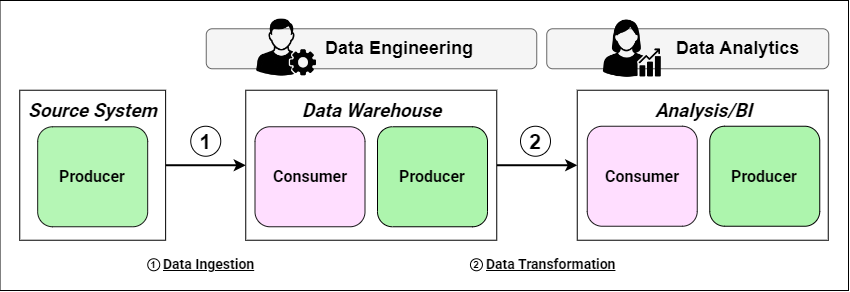
If this is your first time encountering producer-consumer networks (see figure 1) then I highly suggest checking out our initial article on the subject for a nice introduction!
Before getting started, you need to know three terms:
Data Producer: An individual, team, or system responsible for generating data. Their actions directly influence data quality, timeliness, and reliability.
Data Consumer: An individual, team, or system that uses data to achieve their goals. They need good data to perform their tasks.
Handover: The interface where data is passed from a producer to a consumer. Each handover is an opportunity to ensure that data meets agreed quality standards.
Figure 1 shows the producer-consumer diagram for a simplified workflow where data is sourced by external vendor, brought into an internal data warehouse and then served to the BI tool for analysis. The internal Data Engineering team owns the data warehouse and the Data Analytics team owns the analytics/BI capability. We will use this example throughout this post.
Let’s get started!
1. Why Data Quality Is a Producer–Consumer Problem
All data operations rely on moving data from one place to another and transforming it. Every time data moves from one person, team, or system to another, there is the risk of something going wrong and data quality issues being introduced. When thinking about our producer-consumer networks:
Every handover is a risk event. When data moves between systems, it’s exposed to potential issues like missing fields, mismatched formats, incorrect joins.
Consumers inherit producer mistakes. If an upstream stage has bad data, downstream consumers receive it unless suitable checks and remediation are built in.
Quality responsibility is ambiguous without mapping. Without understanding who owns the systems and processes that produce or consume data, it’s unclear who’s responsible for validating data before letting it progress down the workflow.
This post isn’t meant to be a deep dive into data quality issues, so we are going to focus on a few common issues like:
Format changes: e.g. a numeric field is changed to a string.
Missing fields: e.g. customer records arrive without a suitable ID.
Mismatched data types: e.g. timestamps formatted differently across sources.
Without clear mapping of who produces what and who consumes it, responsibility for data quality becomes ambiguous. For internal data workflows, producers (often data engineering teams) create or transform datasets, while consumers (often data analytics teams) depend on those outputs. Without clear mapping, quality responsibilities blur and people naturally make assumptions:
Engineering assumes analytics will validate data before use.
Analytics assumes engineering has already validated the data.
Governance teams lack visibility into where issues originate.
The result is disruptive, quality ownership becomes ambiguous, and small issues slip through unnoticed until they’ve multiplied into a big problem.
A producer–consumer network is a useful tool to map data flows and explicitly tying data quality checkpoints to handovers, where data changes hands and the highest risks live. These networks can help teams catch errors where they begin, clarify ownership and create a continuous improvement cycle.
2. Mapping Quality Risks in Diagrams
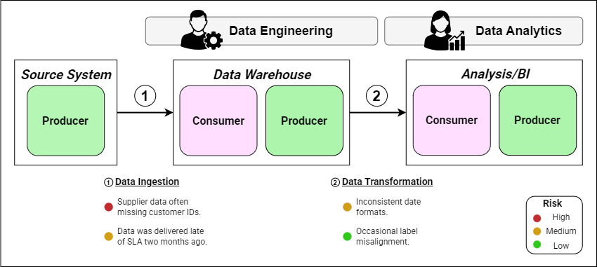
Once you’ve established your producer–consumer network, the next step is to work out where data quality is most at risk. This makes potential weak points impossible to ignore and let’s us be proactive in tackling these issues. For our example, we assume that the major stakeholders got together and identified four data quality risks:
Data ingestion
High-risk: Customer IDs often missing from externally supplied data.
Medium-risk: External vendor doesn’t deliver data in line with the SLA.
Data Transformation
Medium-risk: Inconsistent date formats are passed to the Analytics team.
Low-risk: Occasional metric label misalignment between different data sources.
With these in hand, it’s now time to update our producer-consumer diagram. We annotate each handover with known/expected quality issues, e.g. ‘supplier data often missing customer IDs’. This gives us a single view integrating our data workflow, ownership and data quality risks.
I recommend starting with the high-risk activities like complex transformations, merging multiple data sources, or working with new data sets. This is all about continuous improvement and so it’s best to start with only a few key issues and resolve these before attempting to scale and catch every single quality risk that you may be exposed to.
Most teams I’ve seen use this method have chosen to color-code the risks to make it easier to prioritize tasking. I like to use the traffic light system: red for high-risk, amber for medium, and green for low-risk. Figure 2 shows our producer-consumer diagram enriched with data quality risk information. We can quickly see what issues we need to mitigate and which of those are an immediate priority. This is powerful.
If it fits your company culture, you can also consider using icons to visually differentiate different types of risk. Some examples include⚠️ missing data,
🔄 format mismatch, 🕒 latency issue.
3. Defining Acceptance Criteria at Handovers
Understanding and annotating risk is useful, but to actively improve data quality, you need an agreed definition of good. We want to prevent problems like ‘we thought you were checking that’ and instead hold ourselves to an objective standard.
That means we need to have clear, measurable acceptance criteria for each handover:
Translate business requirements into measurable metrics. Examples:
Completeness: Percentage of non-null values in critical fields.
Timeliness: Service level agreement (SLA) for maximum delay.
Accuracy: Specified variance from trusted reference data.
Assign explicit responsibility for checking each criterion. Examples:
Data Engineering team validates schema conformity.
Data Analytics team checks metric accuracy before reporting.
Data Governance team verifies compliance against standards.
Document agreed formats and thresholds:
Set-up and maintain a dedicated shared space, e.g. Confluence page, data contract documents, or a Git repo. This should be accessed frequently.
Specify the validation method:
For a given data quality issue, define the validation check, and specify the approach used; e.g. automated schema check or SQL validation scripts.
This can be summarized in an easily digestible compact format like:
Handover: Data Engineering to Data Analytics
Dataset: sales_transactions

Acceptance Criteria:
- Completeness: customer_ID must be non-null in 99% of rows
- Accuracy: region_code must match reference table in 100% of rows
- Timeliness: Data must be available by 07:00 AM UTC Monday through Friday
Validation Method: SQL validation scripts ran daily at 07:30 AM UTC

Validation Owner: Data Engineering QA
Sign-off Owner: Analytics Team Lead
Compliance Owner: Assigned Data Governance member
For each of the identified risks in section 3, we assign a check (or more realistically multiple checks) to identify issues early:
The data engineering team orchestrate a daily completeness check for customer IDs as data lands in the warehouse (this can also cover the timeliness check).
Analytics scripts check for date format compliance before pushing data to the consumed data model.
When issues are found, they are fed back to the relevant producers so issues can be fixed at source and not just patched downstream. There is a time and place for patching issues so that you can keep delivering value but the long-term goal should be addressing the root cause issues.
4. Continuous Quality Monitoring
Once acceptance criteria are defined, you can set up automated checks to enforce them at the moment of data transfer. The actual implementation will depend on your exact tech stack and so we won’t go into details here. Instead, let’s discuss what data quality monitoring should include:
Orchestrated tests that run on data ingestion at the handover points.
Automated alerts in your team’s comms channel when thresholds aren’t met.
Dashboards that visualize quality metrics over time, this living view of the system aligns with your producer-consumer diagrams.
Feeding failed checks back to producers for root cause analysis in addition to alerting downstream teams. This two way approach let’s you control the blast radius whilst also fixing root cause issues that may repeat.
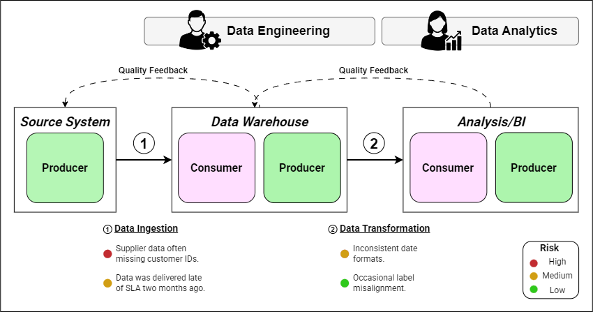
This creates a continuous improvement loop where each iteration strengthens the quality of the entire pipeline. When an issue is detected downstream, results are sent back upstream to the producer to address the root cause issues, preventing them from reoccurring. Figure 3 shows additional Quality Feedback steps which are optional but allow consumers at each stage to raise issues to the producer’s point of contact.
I really like this operating model as it can reduce the impact (and frustration) of data quality issues. I’ve seen first hand that this way of working and democratizing data quality can reduce friction between technical teams and even help build business stakeholder’s trust in data.
5. Final Thoughts
Data quality is still a real issue that many organizations are struggling with in 2025. As a consultant I see the same pattern time and again, teams being reactive to data quality issues, waiting for damage to be done before prioritizing any effort.
I think producer-consumer diagrams are a powerful tool to help strategically shift from being reactive to being proactive in tackling data quality. By embedding data quality thinking into producer–consumer maps, you transform diagrams from documentation artifacts into operational tools. This can help build trust between teams, speed up delivery, and improve decision-making. Your engineers shouldn’t be firefighting, they should be building scalable systems to solve business problems.
I’ve used this to reduce the impact of data quality issues from weeks down to hours.
Before: The Analytics team discovers that 12% of records in the dashboard are missing customer IDs, weeks after the report has been published.
After: The Engineering and Analytics teams work together to define clear acceptance criteria and write automated checks. Data quality dashboards alert the engineering team producing the data within an hour so they can fix the data before it’s used by the analytics team.
We end this post with a checklist that you can use to implement this in your own work. This six step process are the steps I use as a consultant who helps organizations improve their data quality initiatives.
Checklist:
Draw the producer–consumer diagram.
Identify and annotate handovers with known quality risks.
Define and document acceptance criteria for each risk.
Assign owners to each handover.
Automate monitoring and feedback loops (including automated checks and data quality dashboards).
Set a cadence for review and iteration.
      Thanks for reading! Feel free to follow us on LinkedIn here and here. See you next time!

          To receive new posts and support our work, become a free or paid subscriber today.
If you enjoyed this newsletter, comment below and share this post with your thoughts.